UI 设计中经常会用到 Toggle Button,用于切换不同的状态。
UWP 中有
ToggleSwitch
, 长这样:

WPF 中有
ToggleButton
, 长这样:

嗯?????(黑人问号脸)
=========== 分割线 ===========
WPF 中需要给 ToggleButton 自定义控件模板,以实现 ToggleSwitch 的效果,先上效果图:

Style:
<ControlTemplate.Resources>
<Storyboard x:Key="OnChecked">
<ThicknessAnimationUsingKeyFrames Storyboard.TargetProperty="(FrameworkElement.Margin)"
Storyboard.TargetName="path">
<EasingThicknessKeyFrame KeyTime="0" Value="40,0,0,0"/>
</ThicknessAnimationUsingKeyFrames>
</Storyboard>
<Storyboard x:Key="OnUnchecked">
<ThicknessAnimationUsingKeyFrames Storyboard.TargetProperty="(FrameworkElement.Margin)"
Storyboard.TargetName="path">
<EasingThicknessKeyFrame KeyTime="0" Value="0"/>
</ThicknessAnimationUsingKeyFrames>
</Storyboard>
</ControlTemplate.Resources>
<Border x:Name="toggleBorder"
CornerRadius="13"
Background="Green"
Width="60"
Height="26"
BorderThickness="1"
BorderBrush="Black">
<Path x:Name="path">
<Path.Fill>
<LinearGradientBrush StartPoint="1,0" EndPoint="1,1">
<GradientStop Color="White"/>
</LinearGradientBrush>
</Path.Fill>
<Path.Data>
<GeometryGroup>
<GeometryGroup.Children>
<EllipseGeometry Center="6,12" RadiusX="9" RadiusY="9"/>
</GeometryGroup.Children>
</GeometryGroup>
</Path.Data>
</Path>
</Grid>
</Border>
加上 Trigger:
<ControlTemplate.Triggers>
<EventTrigger RoutedEvent="ToggleButton.Checked">
<BeginStoryboard Storyboard="{StaticResource OnChecked}"/>
</EventTrigger>
<EventTrigger RoutedEvent="ToggleButton.Unchecked">
<BeginStoryboard Storyboard="{StaticResource OnUnchecked}"/>
</EventTrigger>
<Trigger Property="IsChecked" Value="True">
<Setter Property="Background" Value="DimGray"/>
<Setter TargetName="toggleBorder" Property="Background" Value="Green"/>
<Setter TargetName="toggleBorder" Property="BorderBrush" Value="Green"/>
</Trigger>
<Trigger Property="IsChecked" Value="False">
<Setter TargetName="toggleBorder" Property="Background" Value="LightGray"/>
<Setter TargetName="path" Property="Fill">
<Setter.Value>
<LinearGradientBrush StartPoint="1,0" EndPoint="1,1">
<GradientStop Color="Gray"/>
</LinearGradientBrush>
</Setter.Value>
</Setter>
<Setter TargetName="path" Property="Data">
<Setter.Value>
<GeometryGroup>
<GeometryGroup.Children>
<EllipseGeometry Center="13,12" RadiusX="9" RadiusY="9"/>
</GeometryGroup.Children>
</GeometryGroup>
</Setter.Value>
</Setter>
</Trigger>
</ControlTemplate.Triggers>
到这儿自定义 ToggleButton 就基本完成了,下面是扩展部分。
=============================
扩展一:High Contrast
实际开发中,往往需要控件支持高对比度(High Contrast):
using System.ComponentModel;
using System.Windows;
using System.Windows.Media;
namespace ToggleButtonStyle
public class HighContrastHelper : DependencyObject
private HighContrastHelper()
SystemParameters.StaticPropertyChanged += SystemParameters_StaticPropertyChanged;
~HighContrastHelper()
SystemParameters.StaticPropertyChanged -= SystemParameters_StaticPropertyChanged;
private static HighContrastHelper instance;
public static HighContrastHelper Instance
if (instance == null)
instance = new HighContrastHelper();
return instance;
public void ApplyCurrentTheme()
if (SystemParameters.HighContrast)
SolidColorBrush windowbrush = SystemColors.WindowBrush;
if (windowbrush.Color.R == 255 && windowbrush.Color.G == 255 && windowbrush.Color.B == 255)
Instance.IsHighContrastWhite = true;
Instance.IsHighContrastBlack = false;
else if (windowbrush.Color.R == 0 && windowbrush.Color.G == 0 && windowbrush.Color.B == 0)
Instance.IsHighContrastWhite = false;
Instance.IsHighContrastBlack = true;
Instance.IsHighContrastWhite = false;
Instance.IsHighContrastBlack = false;
void SystemParameters_StaticPropertyChanged(object sender, PropertyChangedEventArgs e)
if (e.PropertyName == "HighContrast")
ApplyCurrentTheme();
public static readonly DependencyProperty IsHighContrastWhiteProperty = DependencyProperty.Register(
"IsHighContrastWhite",
typeof(bool),
typeof(HighContrastHelper),
new PropertyMetadata(false));
public static readonly DependencyProperty IsHighContrastBlackProperty = DependencyProperty.Register(
"IsHighContrastBlack",
typeof(bool),
typeof(HighContrastHelper),
new PropertyMetadata(false));
public bool IsHighContrastWhite
get { return (bool)GetValue(IsHighContrastWhiteProperty); }
private set { SetValue(IsHighContrastWhiteProperty, value); }
public bool IsHighContrastBlack
get { return (bool)GetValue(IsHighContrastBlackProperty); }
private set { SetValue(IsHighContrastBlackProperty, value); }
注:系统事件在析构函数中最好取消订阅,以减小内存开销。
然后增加相应的 Trigger:
<MultiDataTrigger>
<MultiDataTrigger.Conditions>
<Condition Binding="{Binding Path=IsHighContrastWhite, Source={x:Static local:HighContrastHelper.Instance}}" Value="true" />
<Condition Binding="{Binding RelativeSource={RelativeSource Self}, Path=Tag}" Value="true"/>
<Condition Binding="{Binding ElementName=toggleButton, Path=IsChecked}" Value="true"/>
</MultiDataTrigger.Conditions>
<Setter TargetName="toggleBorder" Property="Background" Value="Blue"/>
</MultiDataTrigger>
<MultiDataTrigger>
<MultiDataTrigger.Conditions>
<Condition Binding="{Binding Path=IsHighContrastWhite, Source={x:Static local:HighContrastHelper.Instance}}" Value="true" />
<Condition Binding="{Binding RelativeSource={RelativeSource Self}, Path=Tag}" Value="true"/>
<Condition Binding="{Binding ElementName=toggleButton, Path=IsChecked}" Value="false"/>
</MultiDataTrigger.Conditions>
<Setter TargetName="toggleBorder" Property="Background" Value="Black"/>
</MultiDataTrigger>
<MultiDataTrigger>
<MultiDataTrigger.Conditions>
<Condition Binding="{Binding Path=IsHighContrastBlack, Source={x:Static local:HighContrastHelper.Instance}}" Value="true" />
<Condition Binding="{Binding RelativeSource={RelativeSource Self}, Path=Tag}" Value="true"/>
<Condition Binding="{Binding ElementName=toggleButton, Path=IsChecked}" Value="true"/>
</MultiDataTrigger.Conditions>
<Setter TargetName="toggleBorder" Property="Background" Value="Aqua"/>
</MultiDataTrigger>
<MultiDataTrigger>
<MultiDataTrigger.Conditions>
<Condition Binding="{Binding Path=IsHighContrastBlack, Source={x:Static local:HighContrastHelper.Instance}}" Value="true" />
<Condition Binding="{Binding RelativeSource={RelativeSource Self}, Path=Tag}" Value="true"/>
<Condition Binding="{Binding ElementName=toggleButton, Path=IsChecked}" Value="false"/>
</MultiDataTrigger.Conditions>
<Setter TargetName="toggleBorder" Property="Background" Value="Yellow"/>
</MultiDataTrigger>
要控件支持高对比度,还需给控件设置 Tag 属性:
<Setter Property="Tag" Value="{DynamicResource {x:Static SystemParameters.HighContrastKey}}"/>
High Contrast White On:
High Contrast White Off:
High Contrast Black On:

High Contrast Black Off:

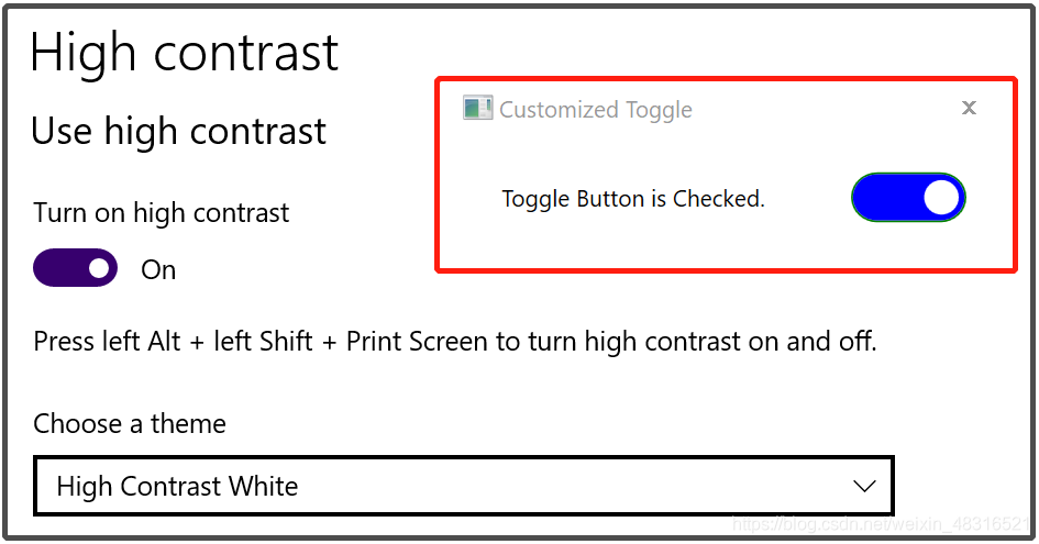
扩展二:Accessibility
开发中往往还需要支持 Narrator 读取文本:
TabIndex="1"
AutomationProperties.Name="CustomizedToggle"
自动化测试 AutomationID:
AutomationProperties.AutomationId="CustomizedToggle"
需要注意的一点是当打开 Narrator,使用键盘的 Enter/Space 键切换 ToggleButton 的时候,其 Click 事件往往不能触发,这时候需要使用其 Checked/UnChecked 事件。
最后附上源码:WPF Toggle Button Style
That’s All, thx~
PS:原创不易,转载请注明出处。
UI 设计中经常会用到 Toggle Button,用于切换不同的状态。UWP 中有 ToggleSwitch, 长这样:WPF 中有 ToggleButton, 长这样:嗯?????(黑人问号脸)=========== 分割线 ===========WPF 中需要给 ToggleButton 自定义控件模板,以实现 ToggleSwitch 的效果,先上效果图:Style:<ControlTemplate.Resources> <Storyboard x:Key="OnC
<LinearGradientBrush x:Key="ButtonNormalBackgroundFill" EndPoint="0.5,1" StartPoint="0.5,0">
<GradientStop Color="#FFFFFFFF" Offset="...
源码下载地址https://download.csdn.net/download/shizu11zz/24417299https://download.csdn.net/download/shizu11zz/24417299
直接贴源码,有帮助的话求点个赞,不过分吧:
【MainWindow.Xaml】
<Window
xmlns="http://schemas.microsoft.com/winfx/2006/xaml/presentation"
要实现在Button里面加入图标或者图形以及文字,我们就需要在Button里面用一个WrapPanel控件,这个WrapPanel控件会把我们的图标或者文字进行包裹,并显示出来。
Xaml:
<Button HorizontalAlignment="Left" Margin="222,151,0,0" VerticalAlignment="Top" Widt...
Xaml代码:
<Window x:Class="WPF0315b.MainWindow"
xmlns="http://schemas.microsoft.com/winfx/2006/xaml/presentation"
xmlns:x="http://schemas.microsoft.com/winfx/2006/xaml"
在上一章讲了单选框样式,单选扩展依赖属性类继承于RadioButton。然后在自定义样式,RadioButton中需要把GroupName设置为同一组名称即可。
复选框实现原理同单选框相同,主要区别在于实现多选需要继承ToggleButton类,此类每个按钮是可以单独选择的。
先看一下实现效果:
增加几项依赖属性和单选框一样。这里就不再多介绍。
/// <summary>
/// 多选框
/// </summary>
public class N
WPF自定义开关切换按钮
突发奇想先要自己写一个开关按钮,说干就开干了,以下为View视图布局代码,开关按钮的样式就直接在这里定义了,主要呢通过定义触发器来完成按钮的切换。
```csharp
<Window x:Class="DEMO.View.StatusWindow"
xmlns="http://schemas.microsoft.com/winfx/2006/xaml/presentation"
xmlns:x="http://schemas.microsof
导入PSD模板完成后,应如图所示。应该只有OFF_Copy这一个画布(Canvas)
然后我们做如图中黄色的那部分操作,把这个画布(Canvas)转成一个UserControl,点击后会弹出一个让你起名字的对话框,输入自定义的名称后会在工程中生成一个UserControl控件。如图所示:
接下来,我们需要做一个控件的模板(Temp
WPF自定义MessageBox是一种在WPF应用程序中创建自定义消息框的方法。传统上,MessageBox是弹出对话框形式的标准Windows消息框,但开发人员可以自定义WPF消息框,以适应应用程序的外观和感觉。
自定义WPF MessageBox需要将对话框视为窗口,并在该窗口中添加自定义UI元素。实现此目标的一种方法是使用WPF的模板技术。通过在模板中定义对话框元素,开发人员可以定义自己的消息框UI。
为了使自定义MessageBox更具灵活性,开发人员还可以考虑使用自己的消息框类,该类包含特定于应用程序的消息框属性和方法。例如,开发人员可以定义自己的标题、文本、按钮和事件处理程序,以便更好地控制该消息框的外观和行为。
总的来说,WPF自定义MessageBox提供了一种强大的用于在WPF应用程序中创建更具个性化消息框的方法。通过使用WPF的模板和自定义类技术,开发人员可以完全定制消息框的外观和行为,以满足应用程序的特定需求。

