

WPF 开源控件库 Newbeecoder.UI推荐:下拉框使用

下拉列表的选择控件,控件左边显示文本内容,右边通过单击控件上的箭头来显示或隐藏该下拉列表,默认的组合框允许选择一项或文本框中输入新的文本。
ComboBox是一个ItemsControl,说明由一个或多个集合项组成,可以包括字符串、图片等。
Newbeecoder.UI开源控件Demo下载链接:
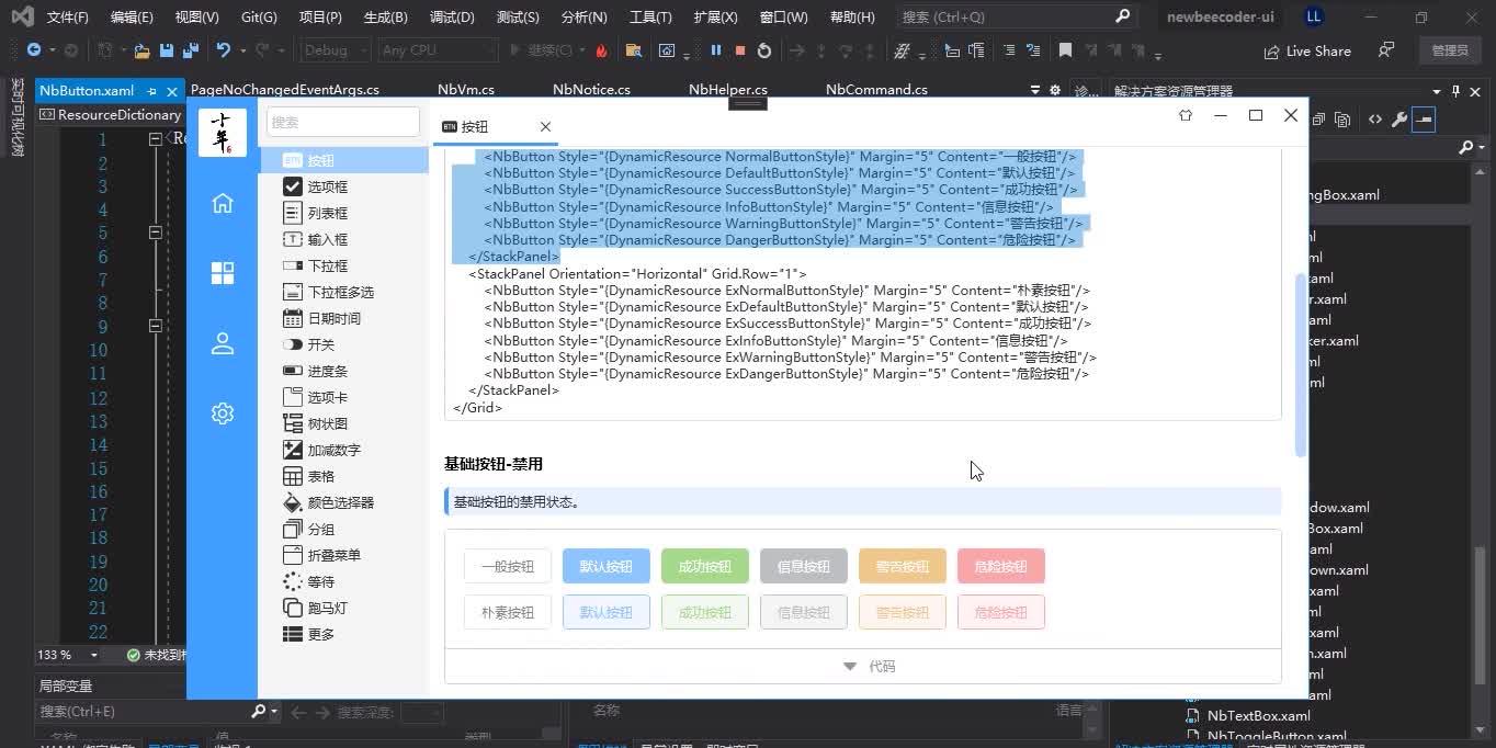
只要你有好看的设计图,基本上都可以用Newbeecoder.UI按设计图开发出来,下面演示开源控件库开发的控件:
 WPF开源控件库:Newbeecoder.UI
https://www.zhihu.com/video/1456296597320081408
WPF开源控件库:Newbeecoder.UI
https://www.zhihu.com/video/1456296597320081408
控件库有几种输入下拉框。分别有可编辑下拉框、不可编辑带搜索功能、带清除按钮下拉框、禁用下拉框。
一、可编辑下拉框使用方法:
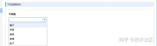

<TextBlock Text="可编辑" Margin="5"/>
<NbComboBox Style="{DynamicResource DefaultComboBoxStyle}" Margin="5" IsEditable="True" EnabledSearchItems="True" EnabledSearchIgnoreCase="True" ShowClearButton="False">
    <NbComboBoxItem Content="橘子"/>
    <NbComboBoxItem Content="苹果"/>
    <NbComboBoxItem Content="香蕉"/>
    <NbComboBoxItem Content="草莓"/>
    <NbComboBoxItem Content="梨子"/>
</NbComboBox>
二、不可编辑带搜索功能下拉框使用方法:
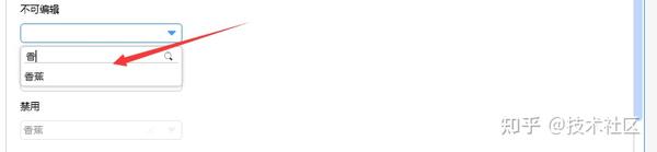

<TextBlock Text="不可编辑" Margin="5"/>
<NbComboBox Style="{DynamicResource DefaultComboBoxStyle}" Margin="5" IsEditable="False" EnabledSearchItems="True" EnabledSearchIgnoreCase="True" ShowClearButton="False">
    <NbComboBoxItem Content="橘子"/>
    <NbComboBoxItem Content="苹果"/>
    <NbComboBoxItem Content="香蕉" IsSelected="True"/>
    <NbComboBoxItem Content="草莓"/>
    <NbComboBoxItem Content="梨子"/>
</NbComboBox>
三、带清除按钮下拉框使用方法:


<TextBlock Text="带清除按钮" Margin="5"/>
<NbComboBox Style="{DynamicResource DefaultComboBoxStyle}" Margin="5" IsEditable="False" EnabledSearchItems="True" EnabledSearchIgnoreCase="True" ShowClearButton="True">
    <NbComboBoxItem Content="橘子"/>
    <NbComboBoxItem Content="苹果"/>
    <NbComboBoxItem Content="香蕉" IsSelected="True"/>
    <NbComboBoxItem Content="草莓"/>
    <NbComboBoxItem Content="梨子"/>
</NbComboBox>
四、禁用下拉框使用方法:


<TextBlock Text="禁用" Margin="5"/>
<NbComboBox Style="{DynamicResource DefaultComboBoxStyle}" Margin="5" IsEditable="False" EnabledSearchItems="True" EnabledSearchIgnoreCase="True" ShowClearButton="True" IsEnabled="False">