


Personal Note for Tableau Certified Data Analyst

内容排版不够好看,有需要可以下载附件,or My Github(markdown)
- Tableau environment
-
Automatic fields
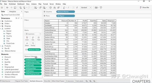
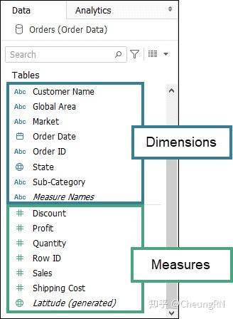
Measure name, measure value, count of table, lat, long
Measure name & measure values Measure name is the name of measure Measure value is the value of measure
Can be used to show measures in different dimension
-
Shelves and cards references
Page shelf: used as filter function -
Tableau file types
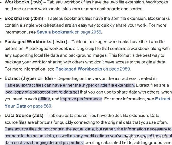
if open .twbx, save as .twb, Tableau will also create a folder, including Data folder and a .hyper file
- Visual cues and icons
Details of visual cues and icons Some categories:
- Data sources in the Data
- Fields in the Data Pane
- Fields on Shelves
- Fields on the Marks card
- Sheets in the Dashboards and Worksheets pane
- Fields in the Calculation editor
- Tableau concept
-
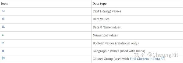
Data type
Some basic types are in the following figure. For more types could refer to Data sources in the Data in 1.4 Visual cues and icons.
Three ways to change the data : - From data source page
- From data pane
-
From view
- Good dataset
- Necessary elements
- Both dimensions and measures(discrete and continuous)
- Disaggregated
-
Order of operation
Very important
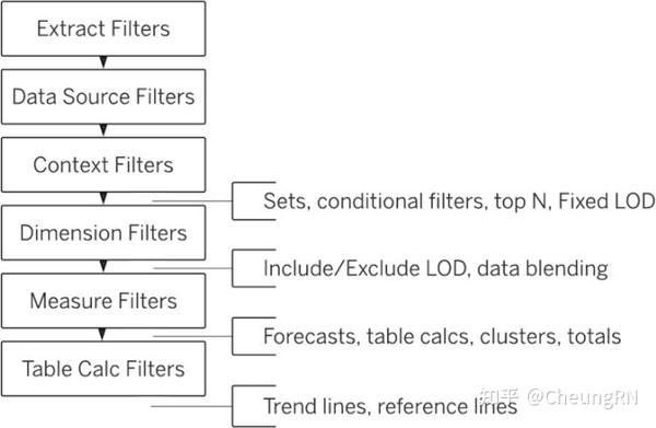
!!!
Context
filter
Eg: when selecting top N in specific condition Such as select top N sales in New York City.
- First step is to set [City] as context, then filter 'New York'
- Then select top N on Customer Name
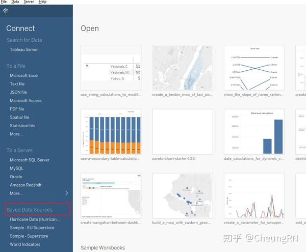
Domain 1: Connect to and Transform Data
- Connect to data sources
-
Choose an appropriate data source
-
Choose
between
live
connection
or
extract
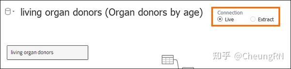
Live(default)
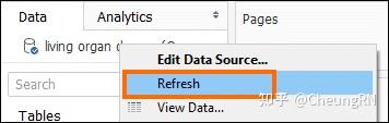
Updated when: 1) opening a workbook or 2) manually refresh(right-click on data source)
Note: if change column name: will occur error. Do solve it, right-click on broken field in data pane, click [
Replace
References
]
Extract
Tableau makes a local copy of a subset of your data.
-
Connect to extracts
Benefits of using extract data(.hyper format): old version is using .tde format - Create extraction for billions of rows of data
- .hyper is faster
- Efficient even for large extract
-
Connect to spreadsheets
Eg: connect to excel -
Connect to .hyper files (or .tde files)
If only share .hyper file: connection information and column name changes will missing
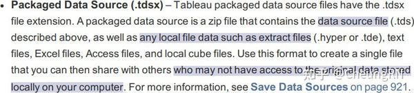
.tdsx or .twbx file" accessible to extract data source -
Connect to relational databases
Knowing how to do is okay, haven't encountered in my exams. -
Pull data from relational databases by using custom SQL queries
Need to know basic SQL syntax such as SELECT, FROM, WHERE, GROUP BY -
Connect to a data source on Tableau Server
Connect panel -> Search for Data -> connect and log in
Data on the server could be downloaded: Data menu -> select data source -> select Create Local Copy -
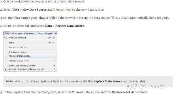
Replace
the
connected
data
source
with
another
data
source
for
an
existing
chart
or
sheet
- Prepare data for analysis
-
Assess data quality (completeness, consistency, accuracy)
What should exam: Unique values
Data type(number, string, date)
Data role(URL, email address, zip code) Null, outliers, unexpected values
Tableau cares more about boniness understandings -
Perform cleaning operations
tTableau Prep -
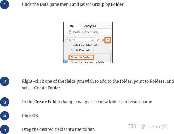
Organize data into folders
Create a new folder: Select multiple fields and right click [ Folders > Create Folder ] Add to a folder: just drag -
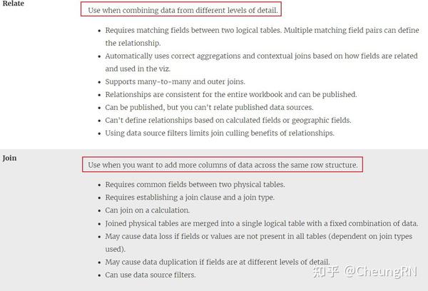
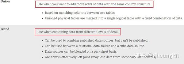
Use multiple data sources (establish relationships, create joins, union tables, blend data)
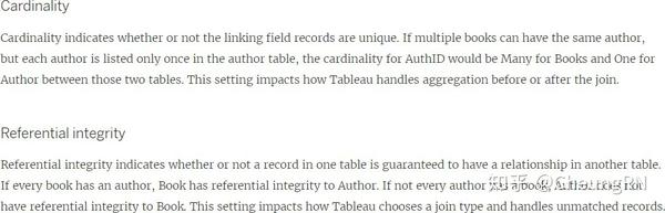
Relationships
Note: relationship(logical tables) in Tableau is different from Joins(physical tables)
Benefits over join
No need join types(left, right, inner...) Automatic identify related fields
Relationship will not merged into a single table Avoid duplications
More refer to Relate Your Data
Requirements
Fields mush have the same data type Geographic field can't define relationships Published data source can't define relationships
Performance options
Exercise
Difference between relationship and joins
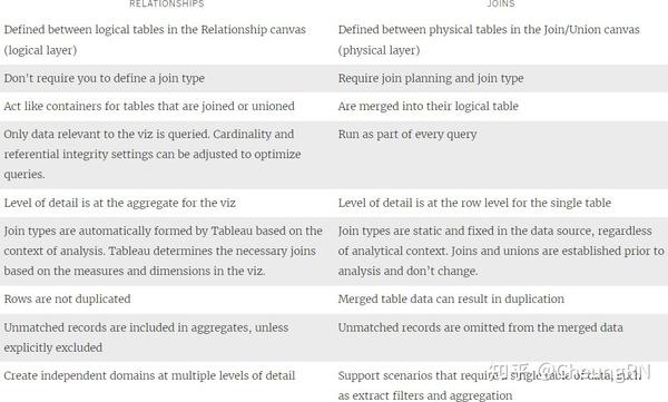
Difference
between
relationship
and
Blends
See more about blend
, blend is used for data in different aggregation levels
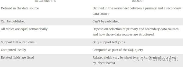
Relationships,
joins,
and
blends
-
Prepare data by using Data Interpreter, pivot, and split
Interpreter Pivot
Automatic selection pivot Customise pivot by SQL: union
Split
Three ways
On the Data Source page, check the menu for Split and Custom Split .
From the Data pane on a sheet, check the menu for Transform > Split and Custom Split
Split manually using the SPLIT function : Split, right, left -
Create extract filters
Link
Good for data security: when published data, can specify query/modify rights for users and groups.
- Perform data transformation in Tableau Prep
-
Choose which data transformation to perform based on a business scenario
Profile pane: summaries(type, distribution, unique counts) Outlier: using detail view
Distribution: using summary view Data grid(original data) -
Combine data by using unions
Link -
Combine data by using joins
Link -
Shape data by using aggregations
Link -
Perform filtering
When selecting a distribution bar or an individual value in the profile pane:
The related values in the profile cards are highlighted in blue The data grid at the bottom is filtered -
Shape data by using pivots
Link
- Customize fields
-
.tds
Tableau preserves the customizations you make, but it does not change the underlying source data.
Benefits of Tableau data source(.tds) - Time-saving: you can reuse the .tds file in different workbooks.
- Collaborative: you can share the .tds file with other users.
Tableau data source(.tds) includes:
Folder structure(Folder, groups, sets) Measure and dimension conversions Attributes (e.g., field names, calculated fields) Field data types (e.g., strings, integers, dates)
Field properties (e.g., how a field is displayed or aggregated)
Tableau data source(.tds) not includes:
Login information
Vizzes created with the data
Save a Tableau data source (.tds) file locally
Remember that saving the .tds to the Datasources folder under My Tableau Repository makes the .tds available from the Connect page under Saved Data Sources
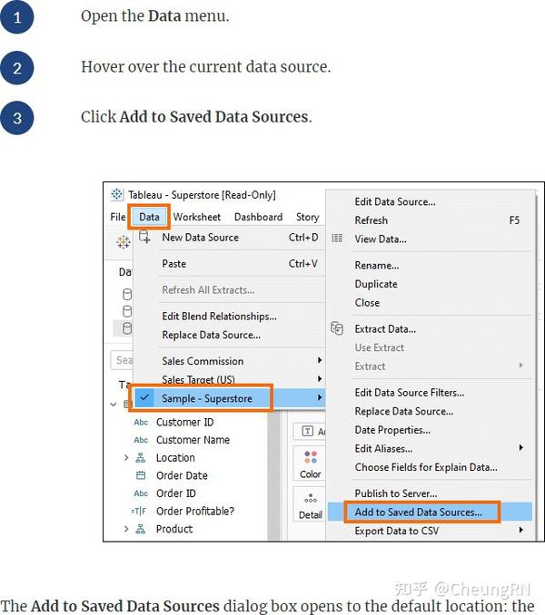
Open a locally saved Tableau data source (.tds) file
In connect page
Folder structure
Measure and dimension conversions
Attributes
- Right-click to rename
- Create an alias
- Only discrete dimension could create alias
- Right-click: Aliases...
Field properties
Dimensions: Comment, Colour, shape, sorted
Measures: Comment, Colour, Number Format, Aggregation, Total using
-
Change default field properties (types, sorting, etc.)
Right click on the field -
Rename columns
Right click on the field -
Choose when to convert between discrete and continuous
Right click on the field -
Choose when to convert between dimension and measure
Right click on the field/drag - Create aliases
Right click on the field
Domain 2: Explore and Analyse Data
- Create calculated fields
- Write date calculations (DATEPARSE, DATENAME…)
| Function | What return | Example |
|---|---|---|
| DATEADD(date_part, interval, date) | Date, adds an increment to the specified date | DATEADD('week', 1, [due date]); DATEADD('day', 280, #2/20/21#) =#November 27, 2021# |
| DATEDIFF(date_part, date1, date2, [start_of_week]) | Integer, returns the difference between date1 and date2 expressed in units of date_part | DATEDIFF('day', #3/25/1986#, #2/20/2021#) = 12,751 |
| DATENAME(date_part, date, [start_of_week]) | String, returns date_part of date as a string. | DATENAME('year', #3/25/1986#) = "1986"; DATENAME('month', #1986-03-25#) = "March" |
| DATEPART(date_part, date, [start_of_week]) | Integer, returns date_part of date as an integer. | DATEPART('year', #1986-03-25#) =1986; DATEPART('month', #1986-03-25#) = 3 |
| DATEPARSE(date_format, [date_string]) | Date, | DATEPARSE('yyyy-MM-dd', "1986-03-25") = #March 25, 1986# |
| DATETRUNC(date_part, date, [start_of_week]) | Date, the first [date_part] day of the [date] | DATETRUNC(month, #9/22/2018#)= #9/1/2018# I'm wondering Tableau made mistake on the last example of this function |
| DAY(date) | Integer, 1-31 | Also WEEK, MONTH, QUARTER,YEAR, and the ISO equivalents |
| ISDATE(string) | Boolean | ISDATE(09/22/2018) = true |
| MAKEDATE(year, month, day) | Date | MAKEDATE(1986,3,25) = #1986-03-25# |
| MAKEDATETIME(date,time) | Datetime | MAKEDATETIME("1899-12-30", #07:59:00#) = #12/30/1899 7:59:00 AM# |
| MAKETIME(hour, minute, second) | Datetime | MAKETIME(14, 52, 40) = #1/1/189914:52:40# |
| NOW() | Datetime | |
| TODAY() | Date |
The
date_part
argument
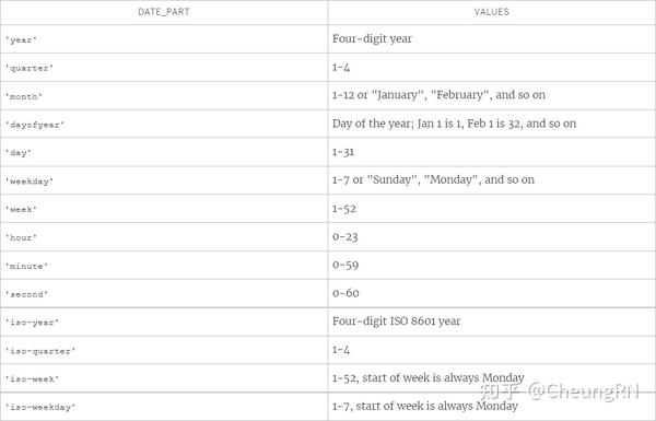
-
Write string functions
Link
| Function | Return | Definition |
|---|---|---|
| ASCII(string)/ CHAR(number) | ASCII('A') = 65/ CHAR(65) = 'A' | |
| CONTAINS/ ENDSWITH/STARTSWITH(string,substring) | Boolean | CONTAINS(“Calculation”, “alcu”) = true; ENDSWITH(“Tableau”, “leau”) = true |
| FIND(string, substring, [start]) | Index/ 0(if not found) | FIND("Calculation", "alcu")= 2; FIND("Calculation","Computer") = 0 |
| FINDNTH(string, substring, occurrence) | Returns the position of the nth occurrence of substring within the specified string | FINDNTH("Calculation", "a", 2) = 7 |
| LEFT(string, number); RIGHT(string, number) | Returns the left/right-most number of characters in the string. | LEFT("Matador", 4) = "Mata"; RIGHT("Calculation", 4) = "tion" |
| (MID(string, start, [length]) | Returns the string starting at index position start | MID("Calculation", 2) = "alculation"; MID("Calculation", 2, 5)="alcul" |
| LTRIM/RTRIM/TRIM | ||
| MAX/MIN(a, b) | ||
| LOWER/UPPER | ||
| SPLIT | Returns a substring from a string, using a delimiter character to divide the string into a sequence of tokens | SPLIT (‘a-b-c-d’, ‘-‘, 2) = ‘b’;`SPLIT (‘a|b|c|d’, ‘|‘, -2) = ‘c’ |
-
Write logical and Boolean expressions (If, case, nested, etc.)
Link
| Function | Description | Example |
|---|---|---|
| IN | IN | SUM([Cost]) IN (1000, 15, 200 |
| IF/ELSEIF/ELSE/ENDAND/OR | IF OR/AND THEN END | |
| CASE...END | CASE WHEN THEN WHEN THEN ... ELSE END | |
| IIF | IIF(test, then, else, [unknown]) | |
| IFNULL | IIF(test, then, else, [unknown]), Returns if it is not null, otherwise returns | |
| ZN | ZN(expression), Returns if it is not null, |
| Function | otherwise returns zero.Description | Example |
|---|---|---|
-
Write number functions
Link , here only list function I'm not familiar
| Function | Description | Example |
|---|---|---|
| DIV | DIV(integer1, integer2) | DIV(11,2) = 5 |
| HEXBINX | HEXBINX(number, number); Maps an x, y coordinate to the x-coordinate of the nearest hexagonal bin. | HEXBINX([Longitude], [Latitude]) |
| HEXBINY | HEXBINY(number, number); Maps an x, y coordinate to the y-coordinate of the nearest hexagonal bin. | HEXBINY([Longitude], [Latitude]) |
| ZN | ZN(expression); Returns if it is not null, otherwise returns zero. |
-
Write type conversion functions
Link
| Function used for | Functions | Example |
|---|---|---|
| Date | DATE/ DATETIME/ DATEPARSE | |
| Number | FLOAT/ INT | |
| String | STR |
-
Write aggregate functions
Link
| Function | Syntax | Definition |
|---|---|---|
| ATTR | ATTR(expression) | If expression has a single value for all rows: return the value of the expression; Else return * |
| AVG/ MEDIAN/STDDEV/VAR/COVAR... | ||
| COUNT/ COUNTD |
-
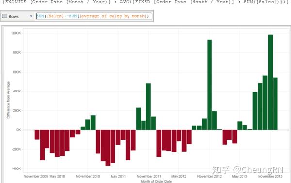
Write FIXED LOD calculations
FIXED, INCLUDE, EXCLUDE
A mixed use of exclude and fixed
-
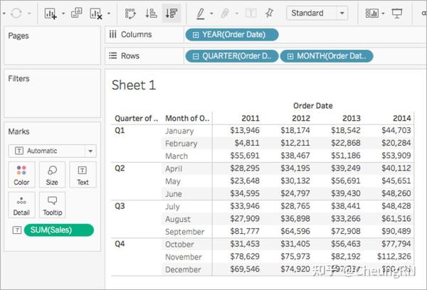
Create quick table calculations
Table(across): row Table(down: column) -
Moving average
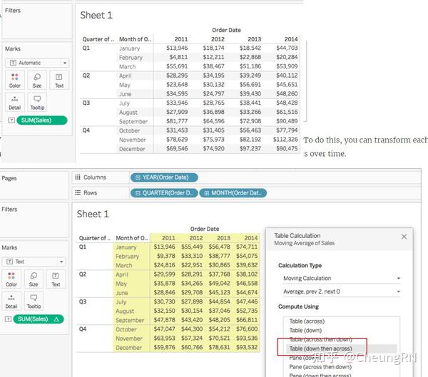
You can see the average sales over time. For example, the value listed for December 2011 is the average sales for October, November, and December, 2011. The value listed for January, 2012 is the average sales for November and December, 2011, and January, 2012
Or could using WINDOW_AVG() function
-
Percent of total
Pane
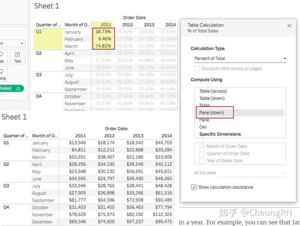
Table

-
Running total
Aggregates values cumulatively in a partition
Could be
| Option | Meaning |
|---|---|
| Sum | Cumulatively add |
| Average | Average of the current and all the previous |
| Minimum | All values are replace by the lowest value in the original partition before the current |
| Maximum | All values are replace by the lowest value in the original partition before the current |
-
Difference and percent of difference
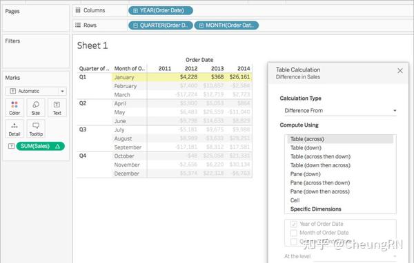
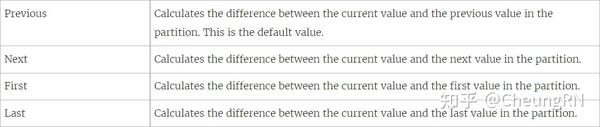
With a Difference From , Percent Difference From , or Percent From : Check relative to
-
Percentile
Percentile table calculation computes a percentile rank for each value in a partition.
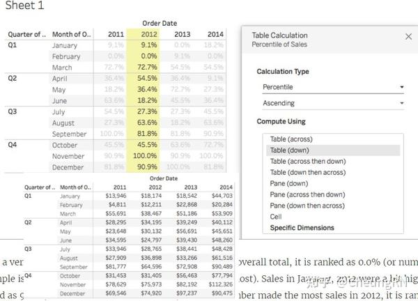
Since February made a very small amount of sales in 2012 compared to the overall total, it is ranked as 0.0% (or number 1 out of 12, since this example is Ascending, and therefore ranked from least to most). Sales in January, 2012 were a bit higher and were therefore ranked as 9.1% (or number 2 out of 12 months). Since November made the most sales in 2012, it is ranked as 100% (or number 12 out of 12)
-
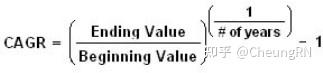
Compound growth rate
Could adjust "Relative to"
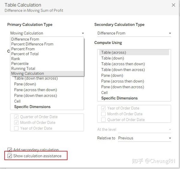
2.2.7 Add Second Calculation
Only with
Running
Total
and
Moving
Calculation
-
Create custom table calculations
I prefer to understanding these concepts by creating a dashboard, one on the left is table calculation sheet; one on the right is the original sheet. In this way, any calculation can be compared between these two.
Also, [Show calculation assistance] is also helpful, highlighting the calculation areas.
- Year to date
- Month to date
- Year over year
-
Index
Need to know the difference between : Index, first, last -
Ranking
If a series = (23, 45, 45, 67), There are four types of ranking:
Competition: results in (1, 2, 2, 4)
Modified Competition: results in (1, 3, 3, 4)
Dense: results in (1, 2, 2, 3)
Unique: results in (1, 2, 3, 4) -
First-last
Explained in 2.3.4 Need to note here is
The logic of using index, ranking, first, last in table calculation is the same of the functions used in filed calculation
Need to know how these are combine used with LOOKUP function
- Create and use filters
-
Apply filters to dimensions and measures
By dragging a dimension/measure in to filter shelf, the the following window will pop out.
Filter dimensions(categorical)
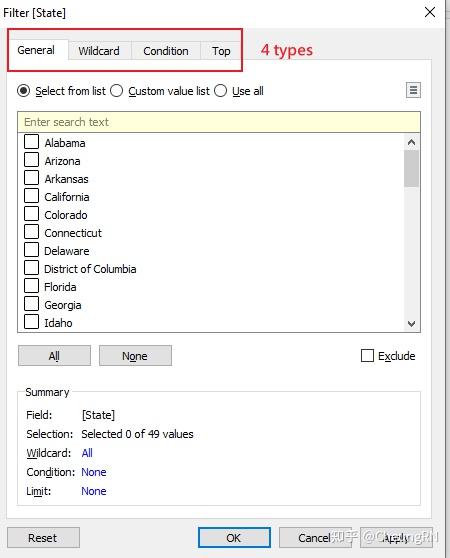
General
: select/deselect from the list or search(Custom value list)
Wildcard
: include XXX contains/starts with/ ends with/ exactly matches exclude XXX NOT contains/starts with/ ends with/ exactly matches
Condition
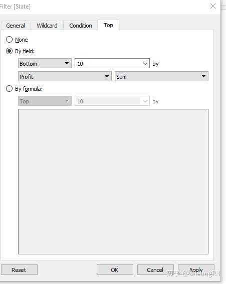
TOP
(like condition, add top/bottom N)
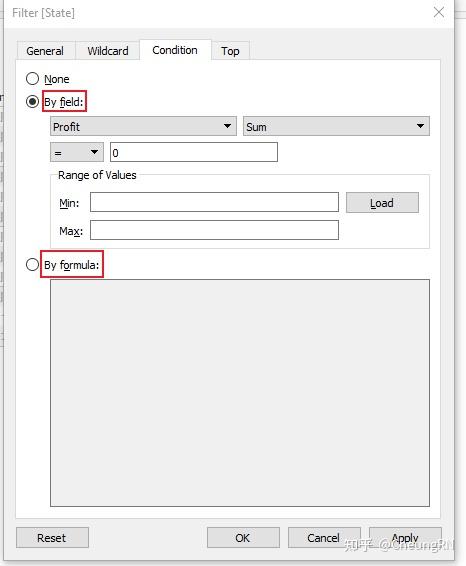
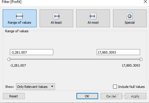
Filter measures(quantitative data)
For example, by dragging profit into filter shelf
Step
1
: to choose a calculation method
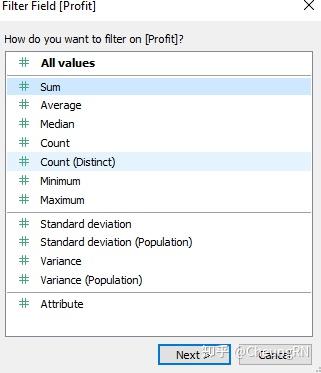
Step
2
: set range
Filter
date:
similar
to
measures
-
Configure filter settings including Top N, Bottom N, include, exclude, wildcard, and conditional
Mentioned in 2.4.1 -
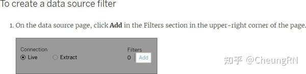
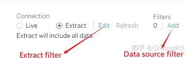
Add filters to extract, data sources, context
Extract filter : In Data Source pane, click [Edit] after selecting [Extract], will be similar as dimension/measure
Data Source filter : Next to [Extract Filter], click [Add], will be similar as dimension/measure
Context filter
Select [Add to Context] in from the dimension/measure filter shelf Some characteristics:
Appear at the top pf the filter shelf
Grey colour
Can't be rearranged
-
Apply filters to multiple sheets and data sources
Official link
Could also refer to e-learning: Create Dashboards and Stories/ Filtering Across Data Or Three methods step by step practical : - Edit data source relationship, filter apply to related data source
- Create calculation field
- Add dashboard actions
-
Create parameters to enable interactivity
Official link include why parameter and how to creat it YouTube video
Parameters won't work by itself, need to combine with the following three ways -
In calculations
Table table could insert parameter to dynamically change the name In Edit filters, Edit Set(dynamically select top N) -
With filters
In edit filter window
Condition : using by formula, could say this is parameter in calculation
Top N : by field or by formula -
With reference lines
Analytics pane, drag and choose, direct
- Structure the data
-
Sets
One example: parameter, top N sets, calulated field,
Sets are costumed field used to hold the subset of data based on a given condition Dynamic Sets
The members of a dynamic set change when the underlying data changes. Dynamic sets can only be based on a single dimension.
How : Data pane, right-click a dimension and select Create > Set . Could use General, condition or Top
Fixed Sets
The members of a dynamic set change when the underlying data changes. Dynamic sets can only be based on a single dimension.
How : Right-click the mark(s) and select Create Set .
Combine Sets -
Bins
Can I say Bins is for measure, Sets is for dimensions? Bins can be more than 2, while sets only 2(in/out) -
Hierarchies
By dragging to the top of another filed -
Groups
Right click on dimension/measure
-
Map data geographically
Mapping Concepts in Tableau (Some useful links are listed on the bottom within this hyper link) -
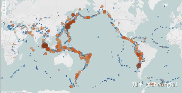
Create symbol maps
Proportional symbol maps: showing quantitative data for individual locations . Eg: plot earthquakes around the world and size them by magnitude
-
Create heat maps
Heatmaps, or density maps, can be used when you want to show a trend for visual clusters of data . -
Create density maps
Tableau put Heatmaps and density maps together, don't know why distinct these two here in exam guideline.
Could adjust colour, intensity, opacity, size

-
Create choropleth maps (filled maps)
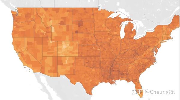
Some other types of maps not required in exams:
Flow maps(path maps)
Spider maps (origin-destination maps)
-
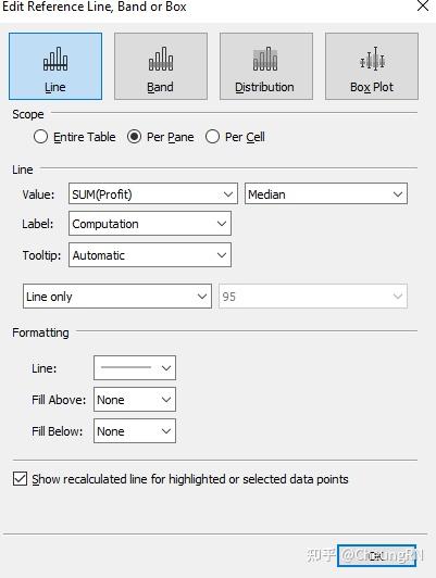
Summarize, model, and customize data by using the Analytics feature
This part won't be difficult, some shares the sample pattern of operation. -
Totals and subtotals
Official hellp
Could do both from Analytic pane(Drag Total) or Analysis menu(Select total)
Mostly use this window(even drag)
-
Reference lines
Same in the window -
Reference bands
Same in the window -
Average lines
Feels like the same as the reference line. Same in the window -
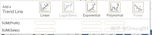
Trend lines
Five types
-
Distribution bands
Same in the window -
Forecast by using default settings
Only available in Tableau Desktop
To remove, edit, or read a description of the current forecast, go to the Analysis menu and choose Forecast . Other lines and bands can be removed by dragging
Forecasting is not supported for views based on multidimensional data sources. In addition, the view cannot contain any of the following:
Table calculations Disaggregated measures Percent calculations Grand Totals or Subtotals
Date values with aggregation set to Exact Date -
Customize a data forecasting model
Enhance Forecast - Drag the same measure into detail
- Right-click - Forecast Result : could see the forecast precision of the tooltip
- Create a predictive model
MODEL_PERCENTILE MODEL_QUANTILE
Domain 3: Create Content
- Create charts
-
Create basic charts from scratch (bar, line, pie, highlight table, scatter plot, histogram, tree map, bubbles, data tables, Gantt, box plots, area, dual axis, combo)
Remind me: highlight table is using "Square" Official Link -
Sort data (including custom sort)
Ways of sorting - From header
- From a field label
-
From toolbar
Could sort dimension filed based on Data source/ alphabetic, field(measure), manual, nested(independent sort within a pane)
- Create dashboards and stories
-
Combine sheets into a dashboard by using containers and layout options
No need explore, all based on needs -
Add objects
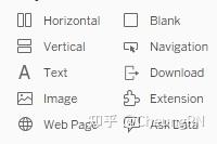
-
Create
stories
Creating stories itself is not difficult, but I found interesting on The seven types of data stories - Change over time : Uses a chronology to illustrate a trend.
- Drill down : Sets context so that your audience better understands what's going on in a particular category.
- Zoom out : Describes how something your audience cares about relates to the bigger picture.
- Contrast : Shows how two or more subjects differ.
- Intersections : Highlights important shifts when one category overtakes another.
- Factors : Explains a subject by dividing it into types or categories.
- Outliers : Shows anomalies or where things are exceptionally different.
- Add interactivity to dashboards
-
Apply a filter to a view
!! In Exam
First select a sheet: use as filter
Right-click on the field to select show Filter -
Add filter, URL, and highlight actions
Show Highlighter is below Show Filter -
Swap sheets by using parameters or sheet selector
!! In Exam
Swap by using parameter note: need to set as floating for the swap effect Another way is two click swap button -
Add navigation buttons
!! In Exam : how to click on the navigation button and redirect to a sheet - Implement user guiding sentences (click…, hover…, menu options)
-
Format dashboards
More practice and play around would be helpful - Apply color, font, shapes, styling
- Add custom shapes and color palettes
- Add annotations
- Add tooltips
- Apply padding
- Remove gridlines, row-level and column-level bands, and shading
- Apply responsive design for specific device layouts
Domain 4: Publish and Manage Content on Tableau Server and Tableau Online
9% of the Exam, I didn't spend much time here
-
Publish Content
To understand a workbook's structure - Original data( credentials )
- Tableau data source(how to access the original data, calculations, extraction period)
- Selecting views
To decide how to connect data and keep it up-to-date
-
Publish a workbook
Need to know - The name of server
- How to sign in
-
Publish a data source
If wish refresh extracted data source: must select Embed password or Allow refresh access If workbook connects to Tableau data source: embedding password - Print content
- Export content
- Schedule data updates
-
Schedule data extract refreshes
!!! In exam - Schedule a Tableau Prep workflow
- Manage Published workbooks
-
Create alerts
!!! In exam - Create subscriptions