 首先新建一个盒子,通过ref获取DOM元素,并设置其宽高(一定要加宽高!)
<div ref="opendoor" style="width: 100%; height: 225px"></div>
创建饼图并修改其样式
var myChart = echarts.init(this.$refs.opendoor);
var option;
option = {
tooltip: {
trigger: "item",
backgroundColor: "rgba(74, 144, 226, 0.84)",
// 右侧的五个小圆球
legend: {
orient: "vertical",
right: 10,
bottom: 20,
textStyle: {
color: "#999",
padding: [2, 0, 0, 3], // 提示内边距
icon: "circle", // 形状
itemWidth: 10,
itemHegiht: 10,
selectedMode: false, // 禁用鼠标移动显示效果
series: [
// 对饼图以及内容的操作
name: "开门渠道占比",
type: "pie",
left: "-22%",
top: "3%",
radius: ["50%", "70%"],
avoidLabelOverlap: false,
// center: ["50%", "50%"],
label: {
show: false,
position: "center",
itemStyle: {
borderWidth: 2,
borderColor: "rgba(16,16,21,0.4)",
emphasis: {
label: {
color: "#4a90e2",
show: true,
fontSize: "14",
lineHeight: 22,
color: [
"#60ADCD",
"#517EDA",
"#C95C45",
"#F6BD16",
"#51BC93",
"#536382",
labelLine: {
show: true,
data: optionData,
option && myChart.setOption(option);
在外层包裹一个函数进行使用
rightBottom() {
if (userChannelData.code !== 0) return;
let optionData = [ {value: userChannelData.data.wxMiniOpenCount || 0, name: '小程序开门'}, {value: userChannelData.data.userFaceOpenCount || 0, name: '人脸开门用户'}, {value: userChannelData.data.appOpenCount || 0, name: 'App开门'}, {value: userChannelData.data.aliPayOpenCount || 0, name: '支付宝开门'}, {value: userChannelData.data.otherOpenCount || 0, name: '其他'} ]
var myChart = echarts.init(this.$refs.opendoor);
var option;
option = {
tooltip: { // 提示框样式
trigger: "item",
backgroundColor: "rgba(74, 144, 226, 0.84)",
// 右侧的五个小圆球
legend: {
orient: "vertical",
right: 10, // 位置
bottom: 20,
textStyle: {
color: "#999",
padding: [2, 0, 0, 3], // 提示内边距
icon: "circle", // 形状
itemWidth: 10,
itemHegiht: 10,
selectedMode: false, // 禁用鼠标移动显示效果
series: [
// 对饼图以及内容的操作
name: "开门渠道占比",
type: "pie",
left: "-22%",
top: "3%",
radius: ["50%", "70%"],
avoidLabelOverlap: false,
// center: ["50%", "50%"],
label: {
show: false,
position: "center",
itemStyle: {
borderWidth: 2,
borderColor: "rgba(16,16,21,0.4)",
emphasis: {
label: {
color: "#4a90e2",
show: true,
fontSize: "14",
lineHeight: 22,
color: [
"#60ADCD",
"#517EDA",
"#C95C45",
"#F6BD16",
"#51BC93",
"#536382",
labelLine: {
show: true,
data:optionData ,
option && myChart.setOption(option);
mounted中调用
this.rightBottom();
把图表中的data单独拎出来进行百分比装换(里面是模拟的数据结构)
let optionData = [
{value: userChannelData.data.wxMiniOpenCount || 0, name: '小程序开门'},
{value: userChannelData.data.userFaceOpenCount || 0, name: '人脸开门用户'},
{value: userChannelData.data.appOpenCount || 0, name: 'App开门'},
{value: userChannelData.data.aliPayOpenCount || 0, name: '支付宝开门'},
{value: userChannelData.data.otherOpenCount || 0, name: '其他'}
结构如下:
tooltip中的formatter属性(提示框设置)
内容如下给出解释:
tooltip : {
formatter: '{a} <br/>{b}: {c} ({d}%)',
效果如下:
鼠标旋移中间的样式如下:
emphasis: {
label: {
color: "#4a90e2",
show: true,
fontSize: "14",
lineHeight: 22,
formatter: '{d}% \n {b}'
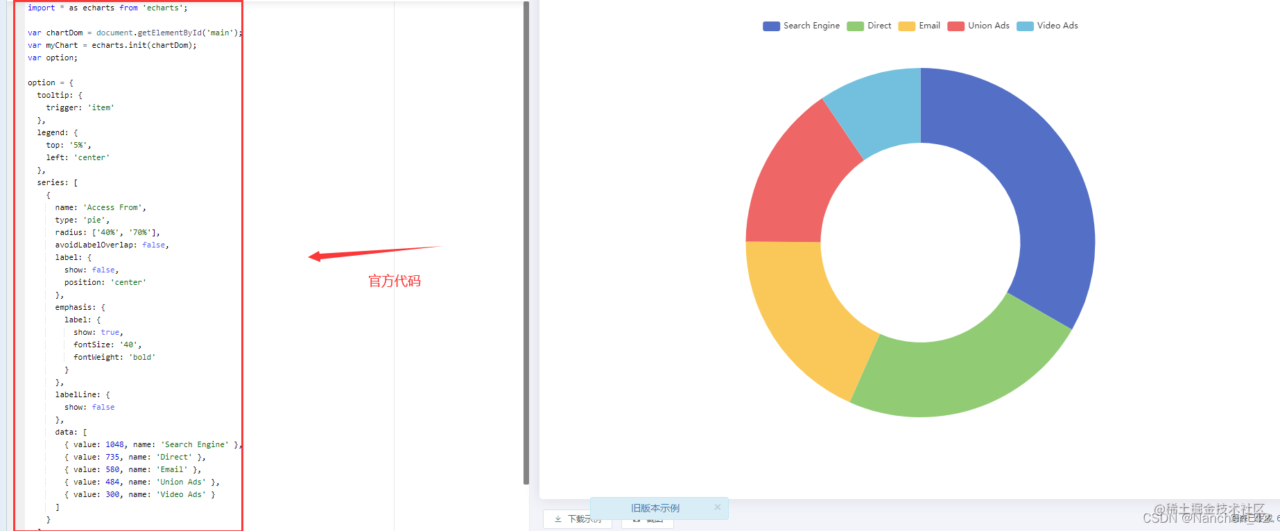
原先官网给出的图
修改之后的效果:
加个自动的时间戳详情见自动轮播提示框